


I'm thrilled to be back here on the blog as a guest designer for April with this little piece of artwork. Jo gave me the brief for the month, 'Colours of the Sea', and my heart did a little skip.
I live in a land-locked country with the sea four hours drive away, but growing up it was just a short one hour drive to the coast. I miss the sea terribly and with this current situation we've not been to the coast in quite some time, maybe even a couple of years. So this theme gave me the perfect opportunity to go a little wild and create something a bit special.
A quick search on Pinterest for images of the sea came up with some stunning photos but one of a tropical beach from above really captured what I was after. The colours and textures were amazing and I knew I could easily find the colours I needed in my WOW! collection. The texture would be a bit harder to recreate but in the past I've used texture paste with embossing powders with great effect so I decided to give this a try again. One of the main reasons for using paste is that when it's heated with a heat tool it bubbles up under the powder creating lots of lovely texture!
I used a piece of 300gsm mixed media paper to create my artwork on as it's thick enough to stand up to lots of layers. I drew a few wavey lines down the middle of the paper to give me a rough guide for adding the paste.

I added paste with a paintbrush to the first section.

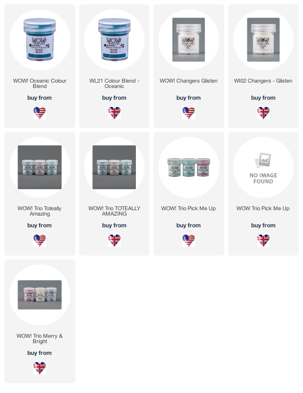
To get the darker blue shade I used Oceanic (what else?). I wanted it to have a slightly sparkly finish as this is an opaque powder without glitter, so I mixed it with a little Glisten from the Changers set which did the job perfectly.

I continued with the other powders (The Real Teal, Iced Teal, Minty), building up the colour graduation and adding a little more in places to make the sea look believably deeper and shallower, finishing with the sandy colour of the Gilded powder for the beach.

To create the look of the foaming waves crashing onto the sand, I again took the paintbrush and stippled more texture paste along the edge of the water and a few spots further in too.

Vanilla Lustre was a great match for foaming waves although there are lots of other beautiful whites I could equally have used.

I absolutely love the end result and I think it came out better than I imagined it to be.

I'll hang this above my desk for a while to calm the longing then add it to my art journal.

Jaine x

UK https://www.wowembossingpowder.co.uk/
Comments
Post a Comment