
Hello WOW! Friends, this is my first post of the year 2021 and i'm looking forward to another incredible year with WOW!
I have some inspirations for you today inspired by Pantone Color Of The Year 2021 PANTONE 17-5104 Ultimate Gray + PANTONE 13-0647 Illuminating. The colorcombo of grey and yellow is so beautiful and i came up with two cards today. Once in warm colours, once in cool colours. I hope you like it. Watch my video about it here:
*** VIDEO ***
In December, Pantone announced that it had chosen two colours of the year for 2021: Ultimate Gray and Illuminating, a combination of matte, familiar grey and the bright yellow of lemon skin.

I chose this colour combination for my card today.
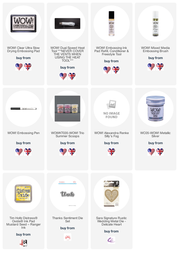
First I use the Gemini Go to cut out the lettering I will need later. It's the Happy from Memorybox, an older die cut but still beautiful. I coloured the bottom edge in yellow with Distress Oxide Ink. Mustard Seed is a warm yellow and I also decided to add glitter. I used the brand new Dicco Bail inspired by Catherine Pooler. This WOW embossing powder is coming out soon and it is fabulous.
I just press the bottom part into the embossing pad and sprinkle the powder on top. Then I use the WOW Dual Heat Tool. Sometimes it is better to heat from the bottom, but here it worked because the colour was very wet and the powder adhered well.
Then I take a card base 4.5x6.5 inches and use the embossing pad on the whole surface. I chose the powder from Alexandra Renke, Silly's Fog. It is a grey with white elements in it. Extremely cool when hot embossed. The rough elements look like a texture, do you see that?

I want to cut out a heart and I used the cutting die from Crafters Companin from the Rustic Wedding collection, but only the inner part. I place it on the cardbase and punch it out with the Gemini Machine.
It's so beautifully filigree, isn't it?
I now prepare the background and use yellow cardstock and cut it to fit in order to stick it behind the base. I glued everything together. Now we need a sentiment. I want to emboss it in silver on yellow cardstock. I prepare the paper with the Antistatic powder tool and then stamp the text. After cutting it to size, I stick it on together with the punched out Happy Sentiment.
I have created another card inspired by the Pantone colours, but in colder colours, using the yellow from the Summer Scoop Trio.

Which do you like better? The warm or the cold design?

Let me hear any questions or your comments, I look forward to it.

Thanks so much for stopping by and stay safe and creative, till next time
Dunja xx
Connect With Us:
Powder Arts Thermography Warehouse LTD, Caslon House, Lyon Way, St Albans, AL4 0LB
UK https://www.wowembossingpowder.co.uk/
USA - http://www.wowembossingpowderusa.com/
Comments
Post a Comment